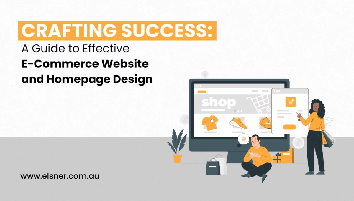
A Guide to Effective E-commerce Website and Homepage Design
E-CommerceWhen you are starting with an online store, what’s your first vision toward attaining success? Well, most of you will agree it’s about getting more traffic to your store and higher sales! Isn’t it?
There are a lot of things that encourage site visitors to purchase from your store, such as easy checkout, proper product categorization, high-quality images and others. But don’t worry, as you don’t have to focus on these aspects individually, but focus on eCommerce website design centrally to get them all addressed.
Yes, may it be your site checkout, product categorization, contact proficiency or any other element, everything relates to the eCommerce website design. This is why it is a priority for you to craft the best appeal for your online store, with all UX aspects considered.
You can definitely hire professionals to help you with eCommerce website design in Sydney, but do you know if they are implementing everything essential? No matter how experienced the agency experts are, you must be insightful about the practical design implementations that must be made.
Therefore, this article is a guide for you to get an insight into the best practices that should be followed while your eCommerce website design is being crafted. Read this along till the end, and you can make sure that your homepage or overall site design turns out to be effective for your business growth.
When Can You Rate an eCommerce Website Good Enough for the Target Audience?
Before taking you to the best practices that the experts offering e-commerce website design Sydney should adopt for your project, let’s understand what makes an online store perfect.
Well, for an eCommerce website to be stated as good enough for the market, it should be able to convince the customers to keep exploring your store products for a longer time. The homepage design should be able to pull the customers in and not push them away! You can determine that by checking your bounce rate.
When your bounce rate is higher, it means a lot of your potential customers are leaving your store without exploring anything beyond the first page. You ought to work on bringing this bounce rate down, and eCommerce website development experts can help you with it.
Not all eCommerce businesses indeed intend to put a similar impact on customers, or target the same audience. Therefore, as you sell unique products to a specific target audience, you must have a strategy for designing your eCommerce site.
These are just a few of the many attributes, as suggested by the eCommerce website development experts, that will add perfection to your online store.
What are Some of the Basic eCommerce Designing Principles that You Must Follow?
Whether you are planning on crafting your e-commerce website design or revamping the existing one, here are some principles that you shouldn’t forget to consider:
-
Work on Building Trust:
People are very much cautious about browsing any unfamiliar website that they suspect of being a fraud platform. It is because they worry about losing their money by giving in sensitive credentials. Therefore, your eCommerce website design should replicate legitimacy and trustworthiness.
You can do it by showing your contact details clearly, which will let the customers know that they can connect with you easily if there’s a problem. Following that, specify the return policies briefly in the homepage itself, so that your potential customers won’t feel like being stuck with something which they might not like.
In the end, you can also display the certifications that you have attained with respect to data and transaction security. This way, your e-commerce website design experts will make sure your online store is able to build trust among potential customers or site visitors.
-
Work on the Visual Appearance:
You ought to invest in acquiring the best e-commerce website design in Sydney because visual appeal is what makes an online store memorable. With the right use of colours, fonts and designs, you can craft your online store to resonate with the target audience.
When you have an appealing and responsive online store, there’s a higher chance people will stay longer on your website and explore pages beyond the homepage or landing page. The theme or appeal of your store should replicate the business idea you are working on.
For instance, if you are selling baby care products, your eCommerce website should replicate that emotion and connection for the parents with vibrant yet soothing colours, attractive fonts and catchy captions. Take the help of professionals offering eCommerce website design in Sydney to get some ideas that resemble your brand.
-
Pay Attention to the Mobile Optimization
Getting along with your eCommerce website development demands you to craft a design that will work well with not just desktop but mobile devices as well. As you know, a large chunk of your target audience will most likely access your online store using mobile devices.
So, you can’t restrict your site design to just bigger screens, as that would lead you to lose out on conversions. The expert eCommerce website development professionals are quite aware of how to add mobile responsiveness to the store design. They will ensure that every site feature or function stays accessible even when accessed through mobile devices.
An eCommerce website can be called the best when it looks appealing and functions unhindered on devices of all sizes. So, this is one of the most crucial principles for you to adopt and implement while crafting your eCommerce website design in Sydney, with expert supervision.
What are the Best Practices to Acquire a Perfect Online Store Design?
You know that a perfect website design is important for running an online store! But what does it take to make one beyond adopting the principles?
Well, when you hire a web development company in Melbourne, you must ensure the experts in their team are aware of the best practices essential for crafting the perfect online store. But how will you ensure the same when you aren’t aware of those practices?
Well, as you have landed on this post, there is no way you are going to leave any loophole while crafting your site design for the eCommerce store. So, here are some of the best practices that a professional web development company in Melbourne should adopt:
1. User Experience Should be a Top Priority
When you are focusing on site design, it’s not just the appearance that you must be serious about! Various design elements contribute to the user experience quotient of the site, and each one of them must be addressed.
It doesn’t matter whether you seek Magento or WordPress development in Sydney; providing a unique experience is irrespective of the platform you choose. Guide your site designing experts to craft an appeal for the store to ensure it emotionally connects with the customers.
In simple words, you want your customers to visualise the products and imagine using them in their daily lives. Therefore, consider using bright colours and high-quality photos to help the customers find your products useful and worth the spend.
2. Align the Design with the Brand Identity
Your online store should be more than just an eCommerce website! It should represent itself as a brand platform. Therefore, whether you seek WordPress development in Sydney or Magento development solutions for your eCommerce business, let the experts know to implement a brand-first approach while designing the site.
This way, you will be able to add value propositions to your site, which will connect to the leads and earn their loyalty. With the brand-first design approach, you will be able to make your website stand out in the crowd of competitors.
A perfect store design with good fonts, colour schemes, iconography and photos replicates the story of your brand. With the unsaid messaging and filtered aesthetics, your customers will most likely resonate with your brand mission and will possibly convert. Aligning your brand with the site design also demands you to be consistent with the brand appeal across all pages.
3. Optimise the Checkout Process
Irrespective of whether you are convinced with Magento or WordPress development in Sydney, the checkout process of both platforms needs to be revamped. WooCommerce, by WordPress or Magento, has complex checkout processes by default.
There is a need for optimizations in order to make the site design intuitive enough for customers to make the purchase and not abandon the cart. As stated earlier, your site design should be responsive and seamless across all pages, including checkout.
Therefore, take the help of WordPress or Magento development experts and integrate custom plugins or extensions to integrate one-step checkout. This way, your overall site design will improve, and the sales rate will stupendously rise. Ultimately, your cart abandonment rate will drop down!
Parting Words
When you seek eCommerce website design for building a great store to run your business on, you must be aware of the basics. It is important to ensure that your store doesn’t lose in the industrial competition. And that’s possible when all design elements and considerations are addressed for your requirements.
Therefore, take this article as a guide for you to learn about the practical implementations that are paramount for your online store design. Hire the best experts and settle for a healthy discussion on what practices they adopt for crafting your website. Now that you know what’s important, set your requirements clearly!


