Is It Time To Redesign Your Website? Know The 9 Signs!
Web DesignIs your website doing good?
Or, it needs a revamp?
How to know that?
Well, business needs sales.
And, your website is a tool to generate sales.
If your website is not bringing you any lead, then it’s time to think about what went wrong.
You can’t decide to redesign your website by merely looking at it.
You have to make a thorough analysis of the website. Check your conversion stats. Read through the content to see if it reflects your brand. Discover where your competitors excel.
Yes! A lot of work!
To help you out with this, we have discussed some crucial points in this write-up.
Your Website Looks Outdated
The digital space is fast-changing and ever-evolving. Something that appealed to the users two years back may have a little influence now. So, even if you have created or revamped your site 2 or 3 years ago, you must check the latest UI/UX design trends of 2020.
• Animated illustrations
• Isometric web design
•Asymmetrical layouts
• Use of GIFs
•Chatbots and Pop-up forms
Today’s audience prefers minimal designs. Flashy and bright gradients are no longer appreciated. A website with asymmetrical layout along with grid views is the most sought after by the eCommerce companies.
In 2020, if your website lacks the above-mentioned elements, it may be challenging to attract visitors.
Your Website Takes Too Long To Load

(Source: himanshusheth.net)
Every second is precious!
If your website is not fast enough for the users, they will simply leave the site and go for the next one in the Google result page.
Ideal load time – 2 to 5 seconds
If your website page takes more than 5 seconds to load, it creates a negative impression on the user’s experience. Hence, this should never be the case.
Your Brand Message Is Blurry
A brand evolves itself over time – that’s how it should be!
If your business is rebranded, then it’s a must to redesign your website.
Else, if your company is offering some new products and services, you must include that information in your content.
Your website is your marketing channel. People will recognize and understand your brand through your site. So, the content of the website must clearly reflect the brand image.
Your Website Lacks Attractive Elements

(Source: neilpatel.com)
Out of all content types, video content is the most popular.
Suppose you are given a choice – either read a 4000-word article or watch a video.
What will you choose?
If you are not the extraordinary one, the video will be your choice.
The reason is apparent – a video is much more engaging and keeps the audience hooked to your content.
You must also put relevant infographics on your site. It quickly grabs the visitor’s attention. The game is how quickly and effectively you can engross the visitors and convey your message to them.
Videos and infographics instantly add an attractive quotient to your website.
Your Website Has A High Bounce Rate
The bounce rate is the most crucial metric in web traffic analysis of a website.
Bounce rate is the percentage of people who come to your site and visit only the page they land on and leave without clicking on anything else or navigating to any other pages on your site.
If your website’s bounce rate is high, it means your visitors didn’t find what they are looking for. Or, maybe, the site didn’t look exciting or engaging.
Your Website Has Complex Navigation
(Source: aqusagtechnologies.com)
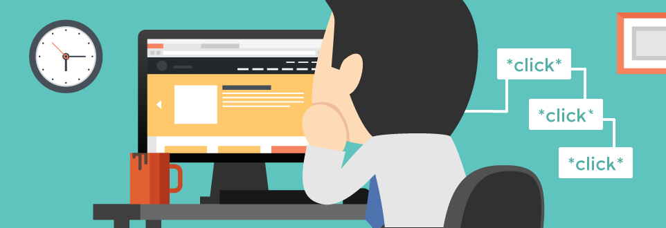
Website navigation is an important factor that decides if the visitor will continue to stay on your site or bounce back. People think a lot of menu options in the navigation bar can be helpful. But actually, too many options confuse users. This creates a negative user experience.
Putting generic navigation labels like ‘products’ or ‘services’ won’t rank you in search results. By doing proper keyword research, pick up the popular key phrases and use them as labels.
Another common feature observed in poorly designed websites is putting the navigation in a non-standard location on the webpage. Visitors prefer horizontal navigation across the top of the site, or vertical navigation on the left side of the page. In recent times, many websites keep vertical navigation across the right side and that’s fine.
A good navigation bar is sleek and descriptive.
Your Website Is Not Device-Friendly
(Source: reachlocal.com)
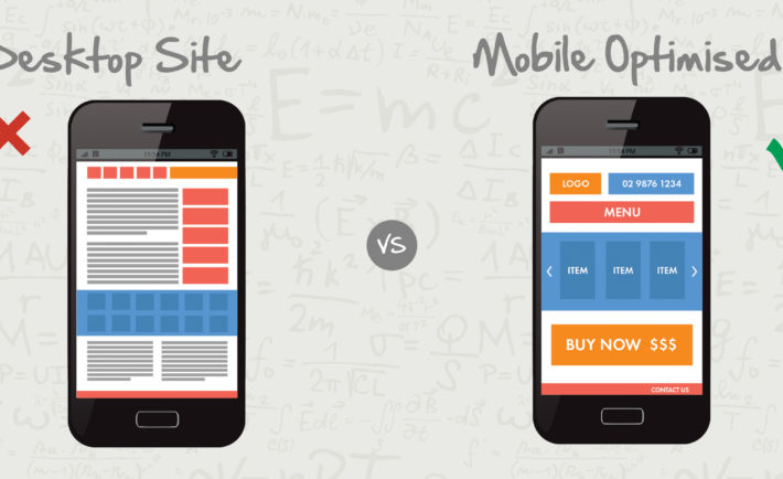
A device- friendly website is one that opens perfectly and can be navigated easily in any device, be it mobile, tablet, laptop or desktop.
Mobile traffic surpassed desktop traffic for the first time in late 2015. And, since then the adoption of digital technology has increased at a massive rate.
And now, mobile-friendliness is one of the most significant ranking factors of Google. So, standing in 2020, if your business website is not compatible with the various mobile devices, you are simply out of the race.
Your Website Is Not Secured
(Source: googleapis.com)
It is not only the design and content of a website that matters. If your business website is not protected, every effort is in vain.
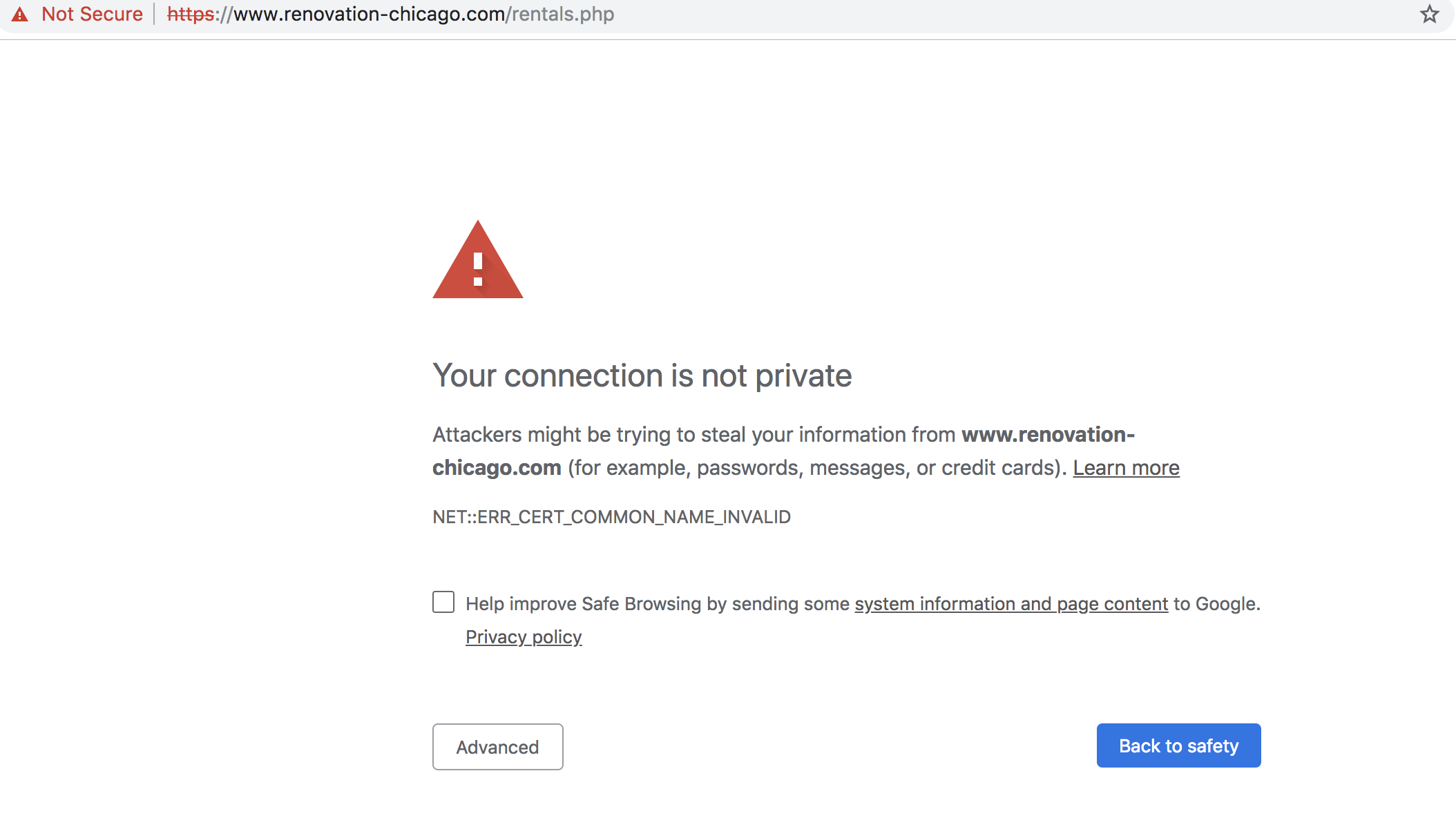
Internet security is a modern age challenge. Your website must have the SSL (Secure Sockets Layer) certification to ensure that it is not prone to malware, hacking and phishing. In short, SSL encrypts sensitive data.
If your website is SSL certified, the web browser opening your website shows a lock icon or a green bar to assure the visitors that they are using a secured connection. So, evidently, SSL builds up the trust factor of a website.
Poor Conversion Rates
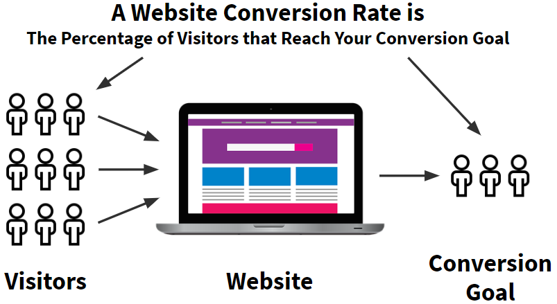
(Source: webdrips.com)
If your website fails to generate enough leads, it not only stagnates the business but also creates a negative impression of your brand in the market.
That’s disastrous!
All the points that have been discussed in the article can contribute to the site’s failure to convert visitors to customers.
So, it is imperative that if you recognize any of the points relatable to your website, you must consider redesigning your website.
Final Thoughts
In this article, we have put forward the top reasons for website redesigning. Fortunately, there are website design companies in Sydney that can effectively address such issues. Not only in Sydney, but you can also hire a prominent web design company in Melbourne. The professionals of the design agencies are focussed on delivering high-end web designs. Redesigning your business website from such experts will enhance your brand value, maximize conversion rates and thus fetch high revenue.
